


Secret Psychology Behind High-Converting Coaching Interfaces

Praveen Kumar
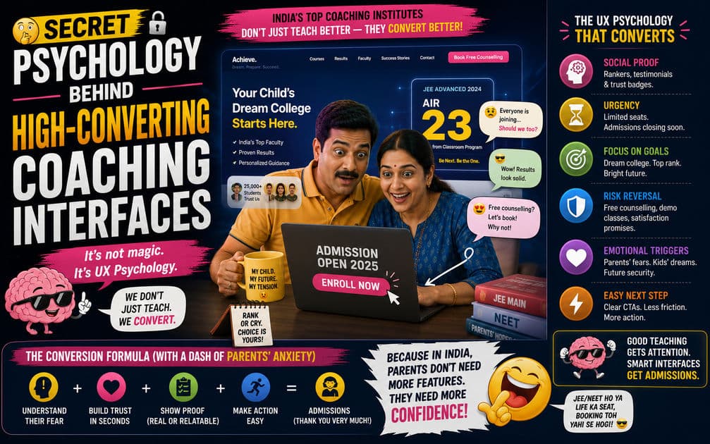
The ₹76,000 Crore Industry Where UX Decides Who Wins
India's test prep and coaching industry is projected to cross ₹76,000 crore. Kota alone has over 200 coaching institutes fighting for the same pool of IIT-JEE and NEET aspirants. Online platforms like Unacademy, PW (Physics Wallah), and Allen Digital have blown that competition wide open — any coaching institute in any city now competes with every other coaching institute in every other city.
And here's what most coaching institute founders completely miss: the battle isn't being won in classrooms anymore. It's being won on landing pages.
When a parent in Lucknow searches "best NEET coaching near me" at 11 PM — anxious about their child's future, overwhelmed by options, and ready to spend ₹50,000 to ₹3,00,000 on the right programme — the first interface they interact with determines who gets that money. Not the faculty. Not the study material. Not the success rate. The website. The landing page. The enrollment flow.
The coaching institutes dominating enrollment numbers aren't doing it with better Google Ads alone. They're doing it with interfaces psychologically engineered to convert anxious, information-overloaded parents into enrolled, paying customers — often within a single session.
This is the playbook most coaching websites in India don't understand. And it's the reason a coaching institute with genuinely better teaching can still lose to a competitor with a better-designed website.
Understanding Who You're Actually Converting
Most coaching institute websites make a fundamental targeting error: they design for students. The homepage is full of animated graphics, bright colours, gamified elements, and language that speaks to a 16-year-old.
But in the Indian coaching market, the student is rarely the buyer. The buyer is the parent — typically a father between 38 and 55 years old, or increasingly, both parents researching together on a shared phone.
This distinction changes everything about how the interface should work.
Parents Buy Relief from Anxiety, Not Features
A parent visiting your coaching website isn't shopping the way someone shops for a phone or a pair of shoes. They're operating from fear. Fear that their child will fall behind. Fear of choosing the wrong institute and wasting a year. Fear of spending ₹2 lakh on something that doesn't deliver results.
Every interface decision on a coaching website must address this anxiety-driven psychology. Features lists and course catalogues don't reduce anxiety — they increase it by creating more choices to evaluate. What reduces anxiety is proof. Certainty signals. Evidence that this decision is safe.
The highest-converting coaching websites understand this. Their interfaces aren't optimised for information delivery. They're optimised for emotional reassurance wrapped in enough data to justify the emotional decision the parent has already half-made.
The Dual-Audience Problem
Here's the interface challenge unique to coaching: the parent makes the payment, but the student has to agree to attend. Many families visit the website together. The interface needs to feel credible and trustworthy to the parent while feeling engaging and non-intimidating to the student.
This dual-audience problem is why generic website templates fail spectacularly for coaching businesses. You need custom design that speaks to both personas simultaneously — professional enough for the parent to trust, modern enough for the student not to dismiss.
The Six Psychological Patterns That Drive Coaching Conversions
Every high-converting coaching interface in India uses some combination of these patterns. Most use all six. Understanding them isn't just academic — it directly translates into enrollment numbers.
Pattern 1: Anchored Social Proof with Specificity
Every coaching website has a "Results" section. Most display them badly. A generic banner saying "500+ selections in IIT-JEE 2025" does almost nothing psychologically. It's a claim without weight.
High-converting coaching interfaces anchor social proof with extreme specificity:
| Weak Social Proof | Strong Social Proof |
|---|---|
| "500+ IIT-JEE selections" | "537 selections in IIT-JEE 2025 — 43 in Top 1000 AIR" |
| "Our students score well" | "Average score improvement: 47% in first 90 days" |
| "Trusted by thousands" | "12,847 students enrolled across 3 cities since 2019" |
| "Top results" | "Priya Sharma — AIR 312 — From our Lucknow batch" |
The psychology here is called the specificity heuristic. Human brains interpret specific numbers as more credible than round ones. "537 selections" feels researched and verified. "500+ selections" feels like marketing estimation. Both might represent the same reality, but the specific number converts better because it signals that someone actually counted.
Real names and faces compound this effect. When a parent sees "Priya Sharma — AIR 312" with a photograph, they don't just process a number. They process a person. A person their child could be. That's an entirely different emotional register, and it moves parents from "considering" to "enquiring" faster than any feature list.
Pattern 2: Strategic Scarcity That Feels Real
Scarcity is the most overused and most poorly executed psychological trigger on Indian coaching websites. Blinking countdown timers. "Only 3 seats left!" banners that have said "only 3 seats left" for six months. "Hurry! Offer expires in 2 hours!" on a page the parent visited yesterday showing the same timer.
Fake scarcity doesn't just fail — it actively destroys trust. And parents who are about to spend ₹1–3 lakh are scanning for trust signals, not urgency gimmicks.
Real scarcity works when it's tied to a genuine operational constraint. "Batch size limited to 45 students for personalised attention" is a scarcity statement that doubles as a quality signal. "Lucknow evening batch: 38/45 seats filled" creates urgency while simultaneously communicating that other parents have already committed — which is social proof reinforcing scarcity. The two patterns compound each other.
The interface design matters here. A progress bar showing 38/45 seats filled is more psychologically effective than text saying the same thing. Visual representations of scarcity — seeing how little is left — trigger loss aversion more effectively than reading about it. The parent's brain processes the almost-full bar and immediately calculates: "If I wait, this fills up."
Pattern 3: Decision Simplification Through Guided Selection
A coaching institute offering IIT-JEE, NEET, Foundation, Crash Course, Dropper Batch, Online, Offline, and Hybrid programmes has at least eight options on their website. A parent landing on this page faces immediate decision paralysis.
High-converting interfaces solve this with guided selection — an interactive flow that narrows options through simple questions before showing any programme details.
"What exam is your child preparing for?" → JEE / NEET / Foundation. "Which year is your child targeting?" → 2026 / 2027. "Preferred mode of study?" → Online / Classroom / Hybrid.
Three clicks. The parent has gone from eight overwhelming options to one or two relevant programmes. Decision fatigue eliminated. Cognitive load reduced. The interface did the thinking for them.
This pattern does something else critically important — it creates micro-commitments. Each question answered is a small "yes." By the time the parent sees the recommended programme, they've already said "yes" three times. Psychologically, they're primed to continue saying yes. The enrollment enquiry form feels like a natural next step, not a cold ask.
Pattern 4: Fee Framing and Payment Psychology
Indian parents are extremely price-sensitive — but not in the way most people assume. They're not looking for the cheapest option. They're looking for the option that feels like the best value relative to the outcome.
How you present fees on your interface matters more than the actual fee amount.
The worst approach: hiding fees entirely and forcing a "call for pricing" interaction. This is still shockingly common on Indian coaching websites. It signals that the price is high enough to scare people away, which is the worst possible frame. Every parent who encounters "call for pricing" assumes the worst and often doesn't call at all.
The best approach: show the full fee upfront, then immediately reframe it.
"Complete IIT-JEE Programme: ₹1,85,000" looks expensive in isolation. But "₹1,85,000 for 18 months — that's ₹342/day for expert faculty, daily practice tests, and doubt-clearing sessions" changes the mental calculation entirely. ₹342/day is less than what most parents spend on their child's daily snacks and auto fare.
EMI breakdowns amplify this effect. "₹15,417/month × 12 months" feels accessible. Razorpay and PayU integrations that show "No-cost EMI available" directly on the fee display reduce payment-page abandonment significantly. The parent mentally shifts from "Can I afford ₹1.85 lakh right now?" to "Can I afford ₹15,000 a month?" — which is almost always yes.
Pattern 5: Faculty as Trust Architecture
Indian parents trust teachers. More than brands, more than institutions, more than advertising. A parent will enroll their child in a new, unknown coaching institute if they recognise and trust even one faculty member.
High-converting coaching interfaces treat faculty profiles as conversion assets, not "About Us" filler.
Each faculty profile should function as a mini landing page: photograph (professional, not a passport photo crop), qualification, years of teaching experience, specific subjects or topics they cover, and — this is what most institutes miss — a short teaching philosophy or approach statement. "I focus on building conceptual clarity before touching formulae. If a student understands why a reaction happens, they'll never need to memorise it" is a statement that resonates emotionally with parents who've watched their child struggle with rote learning.
Video introductions take this even further. A 60-second video of a faculty member explaining their teaching approach generates more trust than an entire page of credentials. The parent sees a real person. Hears their voice. Evaluates their communication style. Subconsciously decides: "This person could teach my child."
The interface design of the faculty section matters too. A grid of tiny headshots with names underneath is wasted space. Each faculty member needs enough visual real estate to function as a trust signal — a card layout with photo, key credentials, and a subject tag, expandable to show the full profile.
Pattern 6: The Trial Class Funnel — Lowest Friction, Highest Conversion
The single highest-converting action on any coaching website isn't "Enroll Now." It's "Book a Free Demo Class."
The psychology is straightforward. ₹1,85,000 is a commitment. A free trial class is risk-free. The parent gets to evaluate the teaching, the student gets to experience the learning environment, and the institute gets a warm lead who has already invested time and attention — making them far more likely to convert to a paid enrollment.
But the interface design of this funnel determines whether it actually works.
The demo class booking form should be three fields maximum: student name, parent phone number, exam/subject interest. Every additional field — email, city, school name, "how did you hear about us" — adds friction that kills completions. You can collect additional information after the trial class, when the parent is already engaged.
The confirmation experience matters equally. After booking, a real-time confirmation — "Demo class booked for Saturday, 3 PM — you'll receive a WhatsApp confirmation in 2 minutes" — eliminates uncertainty. If the parent books and sees a generic "Thank you, we'll get back to you" page, they immediately wonder: did it work? Will someone actually call? The anxiety returns. Automated WhatsApp confirmation via API closes this loop instantly.
The Technical Foundation That Makes Psychology Work
None of these psychological patterns matter if the website takes 5 seconds to load on a parent's ₹10,000 Redmi phone over a Jio connection.
Coaching institute websites in India face a specific technical challenge: their audience predominantly uses mid-range Android devices on variable mobile connections. A custom Next.js build with server-side rendering, image optimisation through CDN, and lazy-loaded components below the fold can deliver a sub-2-second first meaningful paint. A WordPress site loaded with Elementor widgets, three animation plugins, and unoptimised faculty photographs cannot.
Performance is itself a psychological signal. A fast, responsive website feels professional. It subconsciously communicates: "This institute has its act together." A slow, janky website communicates the opposite — and a parent evaluating whether to trust you with ₹2 lakh and their child's future is reading every signal, including page load speed.
Mobile responsiveness isn't optional — it's where 75–80% of your traffic will come from. The guided selection flow, the fee display, the demo class booking form, the faculty profiles — all of these must work flawlessly on a 6-inch screen. If a parent has to pinch-zoom to read your pricing table or horizontally scroll to see your results section, you've lost them.
Your Website Is Your Highest-Leverage Enrollment Investment
Indian coaching institutes collectively spend crores on Google Ads, Meta campaigns, newspaper inserts, banner ads, and school activation programmes. All of that spend funnels into one place: the website. If the website doesn't convert, every rupee spent on marketing is underperforming.
A ₹2–5 lakh investment in a custom-built, psychologically optimised coaching website pays for itself with the first 3–5 additional enrollments it produces — enrollments that would have bounced on a templated, generic interface. Over a 2–3 year lifespan, a high-converting website can be the single most profitable investment a coaching institute makes, outperforming every other marketing channel on cost-per-enrollment.
The coaching institutes that understand this are already winning. They're not competing on who has the flashiest ad creative or the biggest hoarding at the city entrance. They're competing on who converts the most effectively once a parent lands on their page. That's an interface problem. And interface problems have interface solutions.
If your coaching institute's website still looks like a digital brochure — static, generic, and designed to impress rather than convert — it's silently leaking enrollments to competitors who understood this earlier. The psychology isn't secret. The execution is what separates conversion rates.
Published by APXTECK — Custom web platforms and AI automation for education businesses across India. apxteck.com/contact
Article Comments
You must be signed in to post comments.
Sign In to Join the Discussion →No comments approved yet. Be the first to share your thoughts!
About the Author

Praveen Kumar
Co-Founder & DirectorFull-Stack Developer, APXTECK, chatgpt, google
Praveen Kumar is the Co-Founder and Full-Stack Developer at APXTECK, an AI-powered IT agency helping Indian SMBs grow through web development, automation, and AI integration. He builds production-grade systems using Node.js, Next.js, PostgreSQL, and modern AI APIs. When he is not shipping code, he is writing about practical technology that actually works for Indian businesses.
Related Insights

How Node.js Development Empowers SMBs in Maharashtra

The SMB Guide to Scaling Down Enterprise Tech on a Budget

How Business Automation Saves 20+ Hours of Manual Work Weekly
Why Traditional SEO Is Dead: Preparing for Generative Search

Next.js ISR: The Real Weapon for Better Search Rankings

How to Architect a Multi-Tenant SaaS That Actually Scales

Mobile App Development for B2B Enterprise Software